Analyzing your property with the Property Chart View
With the Analyze Property tool (model > Rock Properties > Analyze Property or model > Facies > Analyze Property) you can open a Property Chart View which provides you with statistical plots of your raw data, upscaled data and (if available) modeled results, enabling you to QC your data in a methodical and statistically rigorous manner. During property modeling, there are two moments when the use of this tool is recommended:
- Directly after you have upscaled your data, to ensure that the selected upscaling algorithm produces an upscaled grid property that closely resembles the statistics of the original log data.
- After you have performed a modeling run, to ensure that the selected modeling algorithm produced a modeled grid property that closely retains the upscaled grid property.
The input to the charts can either be a discrete or continuous property. The tool is available from both the Facies and Rock Property strips, and from either strip you can choose to plot either a discrete (facies) or continuous (rock) property.
To open the customized Property Chart View
- Click the Analyze Property button(model > Rock Properties > Analyze Property or model > Facies > Analyze Property) to open the Analyze Property form.
- Under Grid, select the 3D grid that contains the property that you want to analyze.
- Under Property, select the upscaled or modeled property.
- Click Apply (and keep the form open) or OK to open the Property Chart View. Depending on the selected property, the chart view contains the following charts
- When you select an upscaled property, a histogram is generated, containing Raw and Upscaled data; when you select a modeled property (i.e. the property that is generated after you have completed a modeling run) the charts contain Raw, Upscaled and Modeled data.
- When you select a discrete property (e.g. facies), the Property Chart View contains both a histogram and a Vertical Proportion Curve (VPC); when you select a continuous property (e.g. porosity) then the Property Chart View contains both a histogram and a Vertical Trend Curve (VTC).
- Optional. You can display histogram statistics in table format by clicking the Show statistics button (see image below). To display the legend, right-mouse click on a chart to open the Chart Settings dialog, and select Show legend.
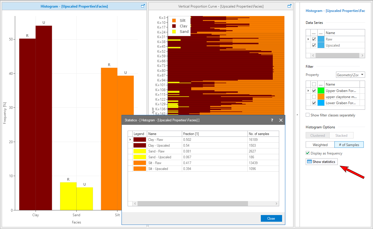
The Property Chart View. You can display histogram statistics in table format by clicking the Show Statistics button. click to enlarge
Controlling the Property Chart View display settings
The Property Chart View has a sidebar on the right-hand side that contains controls for manipulating the chart that is currently active. The active chart can be recognized by a blue bar above the chart (when the bar is white, it is inactive and you can click it to activate). This sidebar can be opened and closed by clicking the blue arrow button (see image below). When the sidebar is closed, the arrow points to the left. When the sidebar is open the arrow points to the right.
The sidebar controls vary according to the type of chart (histogram, VPC or VTC). When you switch the active chart from one chart to another within the same Property Chart View, the content of the sidebar switches to the specific controls and current settings for that chart. The name of the active chart is shown, together with an icon indicating the type of chart (histogram, VPC or VTC) at the top of the sidebar.
There are different sections of controls present on the sidebar for different chart types. In some cases the specific combination of controls within a control group can vary per chart type as well.
Data Series
The Data Series section appears in the sidebars for both histogram, VPC or VTC charts. Check the boxes for the data series that you want to display simultaneously:
- for Histograms: Raw + Upscaled data for an upscaled property; Raw + Upscaled + Modeled data for a modeled property.
- for VPC: Upscaled data for an upscaled property; Upscaled + Modeled data for a modeled property.
- for VTC: Upscaled data for an upscaled property; Upscaled + Modeled data for a modeled property.
Realization Only available for a modeled property. Select which realization of a modeled property you want to plot, i.e. which realization to display the data for. Enter a realization index or click the up/down arrow to increase/decrease the index selected. If you enter a realization index that doesn’t exist, a red cross appears in the field.
Filter
Here you find controls that enable you to filter a histogram, VPC or VTC chart within the Property Chart View. Filtering a chart means that data subgroups within each data series are either included or excluded from the chart.
Show filter classes separately Only available for histograms. When checked, each filter class is displayed individually.
Histogram Options
Number of bins Defines the number of groups and values that you want to divide the histogram of a continuous property into. The default is 10.
Clustered / Stacked These buttons become enabled when a histogram is filtered and the filter classes are displayed individually ('Filter' section below). If you select 'Clustered' the bars for each data series are plotted side by side, for each filter class and for each property bin/class plotted along the x-axis of the histogram. If you select 'Stacked' the bars for each filter class are stacked on top of each other, per data series, and per property bin/class. 'Clustered' is the default. Histograms that are either unfiltered (Filter Property = None) or have their filter classes combined ('Show filter classes separately' unchecked) can only be clustered.
Weighted / # of samples If you select 'Weighted', the frequencies are cell volume-weighted (i.e. cells with large height contribute more heavily to the result than cells with small height); if you select '# of samples', every cell value is counted equally.
Display as frequency Automatically checked when 'Weighted' is selected. If you check this box, the number of samples (per bin or class of a data series) is divided by the total number of samples in that data series, and multiplied by 100. These relative frequencies are plotted.
To display the legend of any of the charts, right-mouse click on a chart to open the Chart Settings dialog, and select Show legend.
You can display histogram statistics in table format using the Show Statistics button in the sidebar of the Property Chart View.